As a huge fan of 2D side-scrolling platformers, looking at how smartly a 2D world is constructed with art assets and motion designs has always been an enjoyable process. Among various details that constitute a coherent platformer experience, I often time find the camera movement being something that could instantly change the feel of the game. Cameras are the eyes with which we players perceive the game world, and given the lack of one dimension, it is of more significance to have a properly designed camera movement for 2D games since what players can see is already less than in a 3D experience.
While the camera movements in Super Mario being the one that players and designers often look at, there are other renown 2D platformers that in fact have very different designs that are worth looking at as well. Why do those game choose the specific design? What can we as designers learn from them?
Super Mario Bros (1985)
In the classic Super Mario Bros, given that the level mainly expands horizontally, the camera only moves horizontally. The camera movement is affected by a camera window–the camera will only follow the player when the player reaches the edge of the window, in this case is roughly the center of the screen. When moving, the camera directly snaps to where the player is, meaning that there’s no smooth movement or any slight delay. But players still perceive a smoothing effects because the movement of Mario himself has a fade-in and fade-out process. Interestingly, when players try to walk backwards in Super Mario Bros, the camera won’t follow them to go back and therefore restricts how much players can go back.
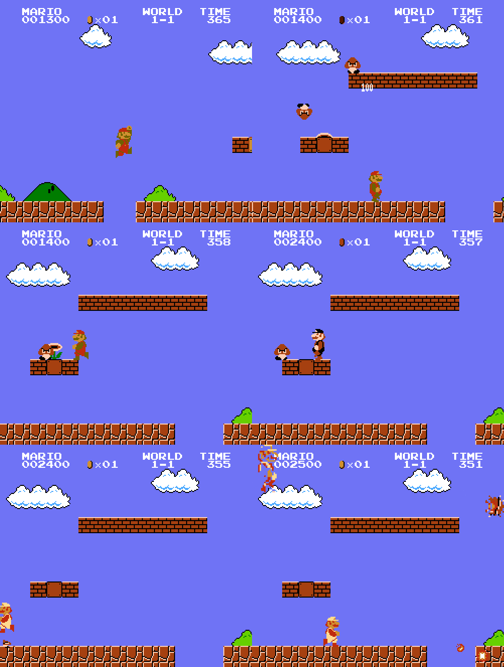
Super Mario Bros is a very hardcore platformer where players are expected to pay attention to how platforms are laid out and what the enemy patterns are. There are a lot of situations where players need to do micro-adjustment while standing at the edge of a platform. Therefore it would make sense for the camera only to move after exceeding a certain window as opposed to always snapping to the player, which could be visually annoying. It makes sense for them to set the edge of the window at the center so that players can have enough view of what’s to come and have enough time to react. The game doesn’t allow the camera to scroll back because it wants players to dash forward instead of wondering around and explore.
Mega Man
Technically, it’ll be inaccurate to talk about Mega Man series as a whole since different games under the franchise have slightly different camera movement design. In the original Mega Man series, the levels are divided into chunks. A lot of chunks are just the same size as the camera view, and the camera would be still most of the time when players move inside a chunk. There are, however, some chunks of the level that are longer or taller than the camera view. In those chunks, the camera will directly follow the player in a linear fashion, placing the player almost at the center, until the camera reaches the edge of a chunk. When players go from one chunk to another chunk, the camera will entirely shift from one chunk to another before players can start moving.
In Mega Man Zero series, although the camera design is very similar to the original Mega Man, the levels are divided into bigger and less chunks. Therefore players experience a lot more camera movements than in the original Mega Man.
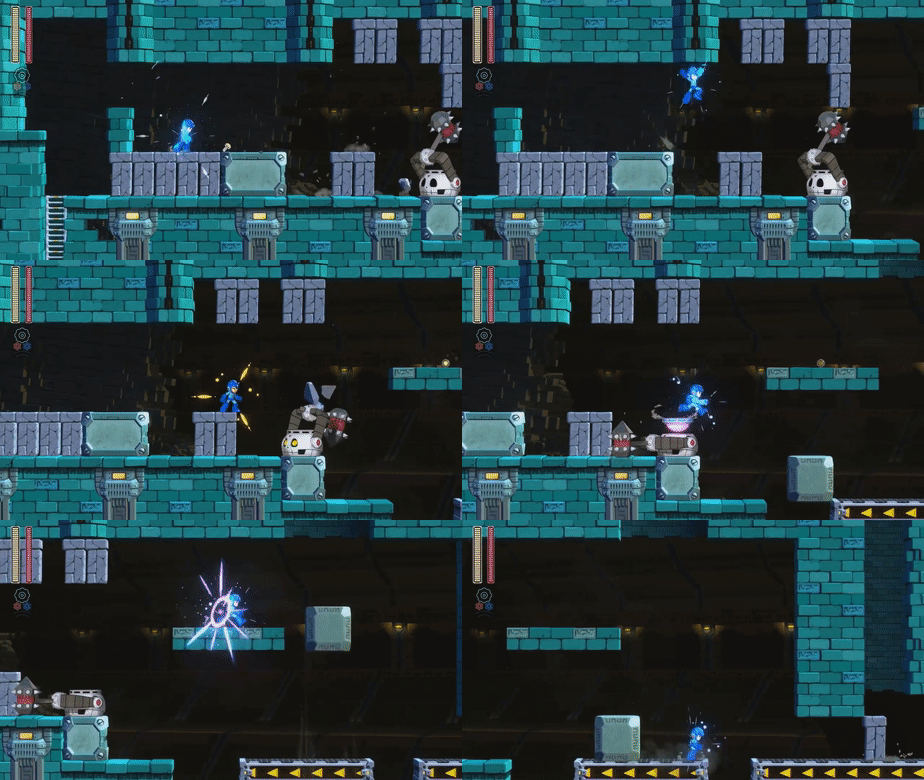
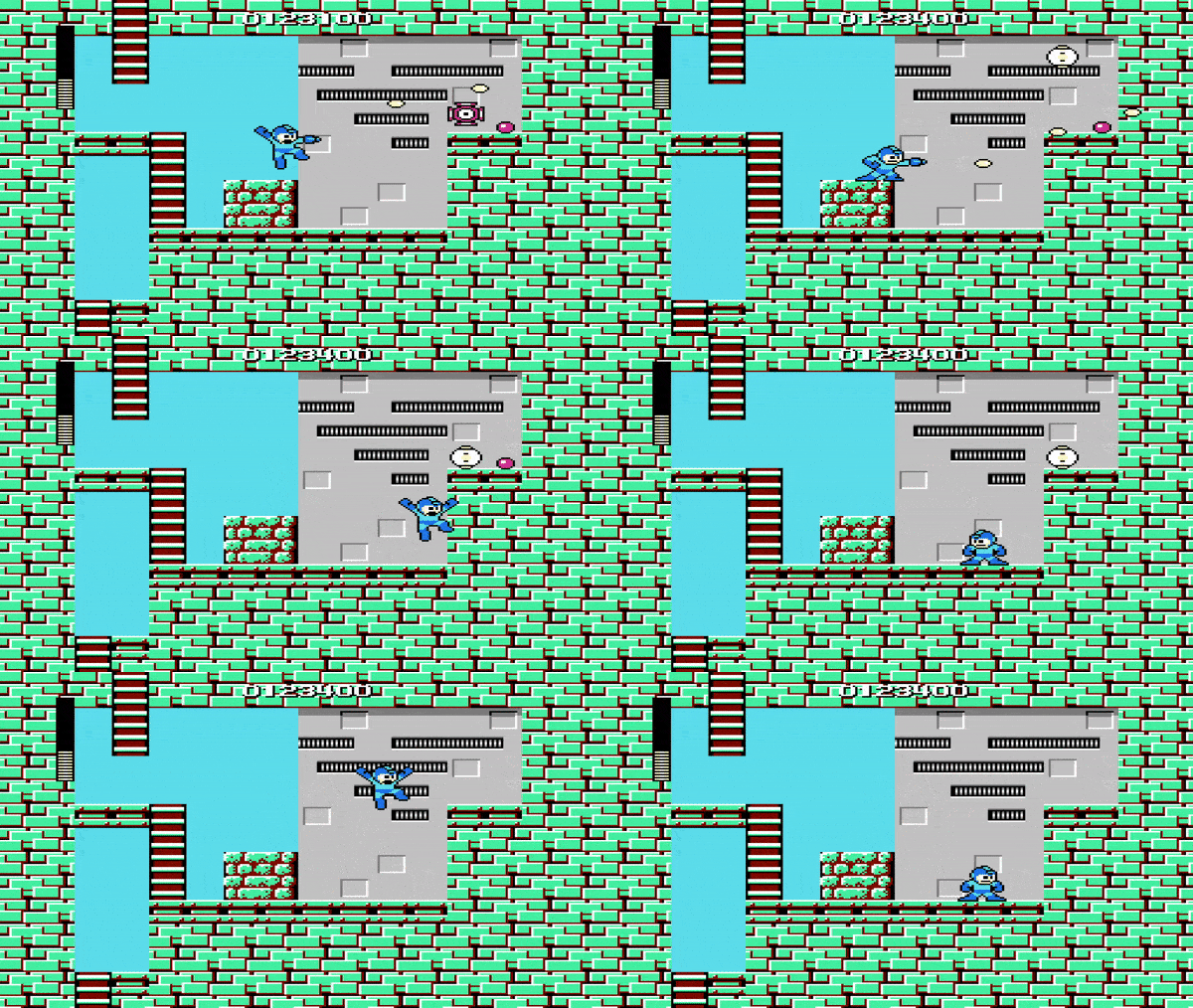
Comparing to Super Mario Bros, Mega Man requires even more strategy and dexterity from players when they traverse through their super difficult levels. Having the camera view being the same size of a level chunk and therefore having mostly static camera view helps focus player’s attention to the structure of the level chunk as a whole (including where the platforms are and where the character is in relation to the level), which is the key to Mega Man‘s gameplay.
Ori and the Blind Forest (OBF) & Hollow Knight
OBF and Hollow Knight, though their camera design is not exactly the same, do share a lot of common approaches when creating more organic than mechanical camera movements. In both games, the camera movement is smoothed, meaning that the camera smoothly travels from one point to another with some slight fade in and fade out effects, as opposed to linear movement in Mega Man. Both games also have inconsistent camera offsets, meaning that the relative position of the camera to the player can change depending on the area the player is in. This dynamic design allows designers to control what players can see at certain point of a level with more flexibility.
Comparing to Hollow Knight, one thing that OBF did and the former did not do is the resizable camera view. This benefits the storytelling aspects when the designer intend to convey certain feelings (for example, when they want the player to see an entire big enemy and to realize how small and powerless they are).
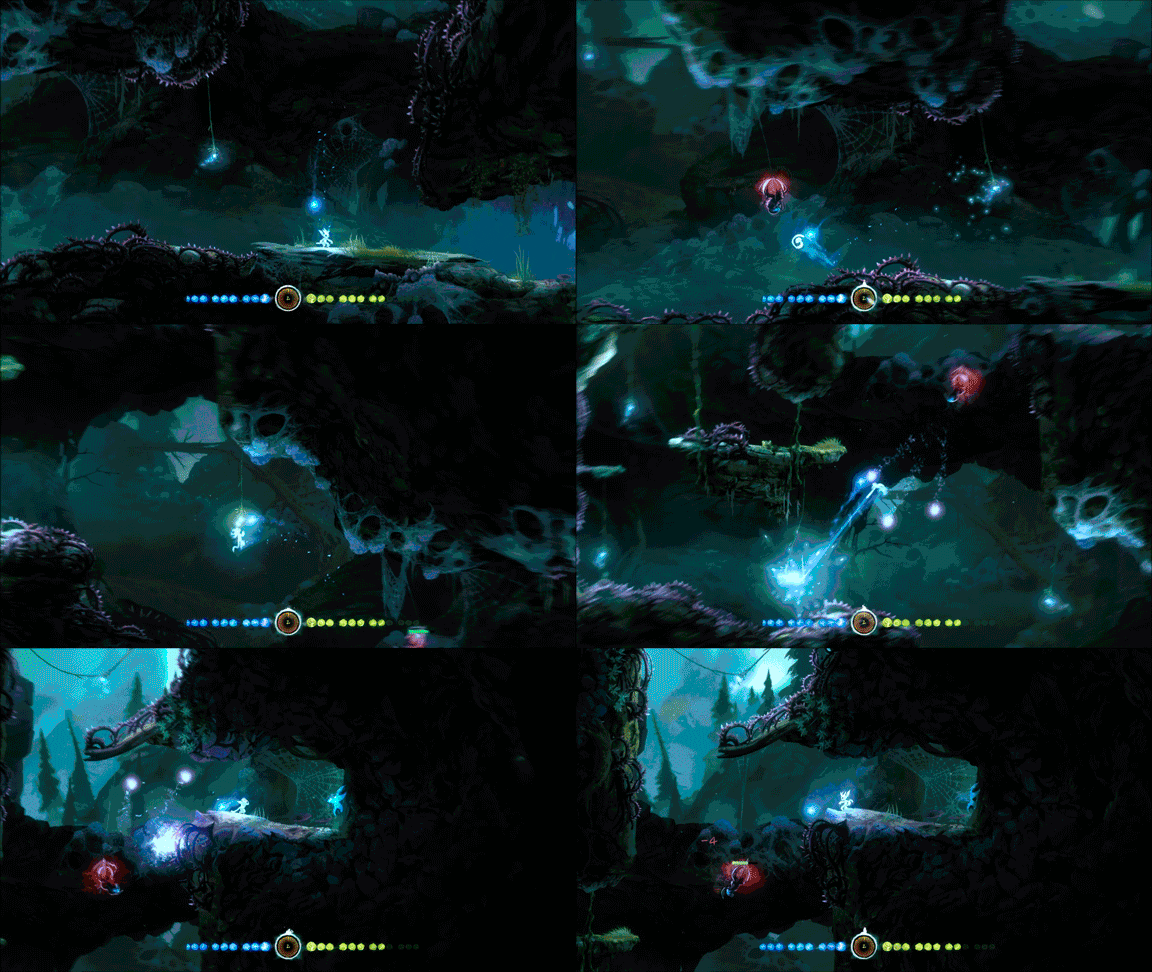
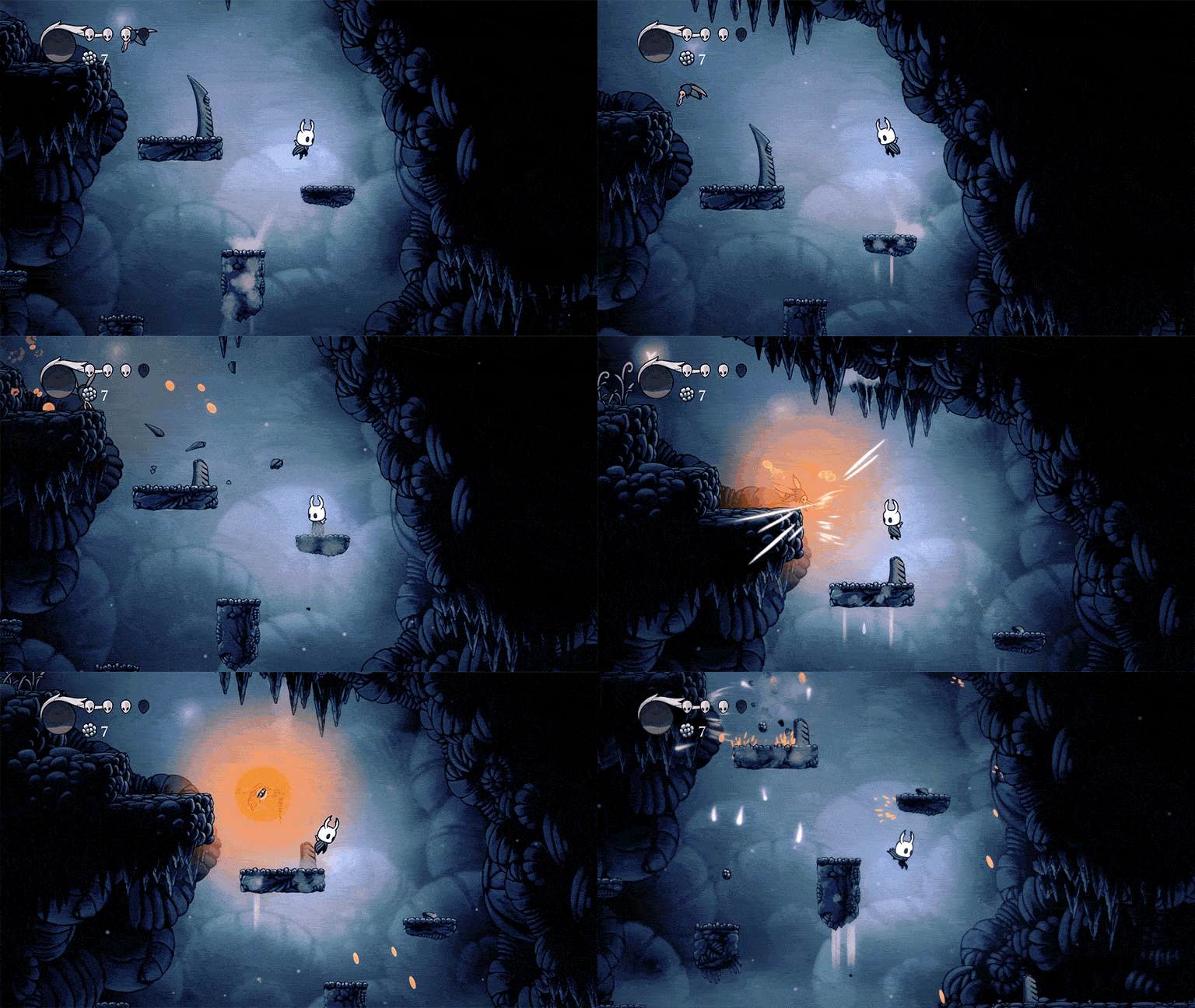
Very different from Super Mario Bros and Mega Man, these two games have a huge portion of storytelling and exploration elements. Having smoothed camera movements conveys a feeling that slows the player down and let them pay attention to the game world. The structure of levels and the locations of the platforms in OBF and Hollow Knight are also more irregular whereas you can pretty much see the first two games have their levels designed within square chunks. Therefore OBF and Hollow Knight need to constantly shift their camera offsets to always make sure players can see enough of the levels to strategize no matter where they stand.
So when you make your own 2D side-scrolling platformers, well, you could certainly invent your own camera movements, but how do you know where to start? Which one should you choose?
The immediate answer would be to choose the one that “feels” right given the type of experience you are building. This might not be applicable to all situations, but given what we can see from the four games above, it might be a good start to think about the pace of the game. If you’re building an intense experience, maybe having a very rigid and mechanical camera movement will work well. Or if you are trying to make an exploratory experience, maybe you want to start with smoothing out your camera movements.
The size of your camera view also matters. It’s often determined by how much visual information you want players to see at every single instance of the game. Do you want players to see the platforms above them? Do you want them to feel confined in space? Do you want them to see the entire map and strategize?
Making camera movements is for sure a tricky process and definitely requires a lot of tweaking. Some times even if you made the right choices you might encounter other problems such as making players feel dizzy (trust me, this can happen with 2D games as well). This is really a craft process that’s worth digging deeper into.